Case Study: Bromil spirits labels
Bromil s.r.o. is a medium-sized farm located in a central Bohemian region close to Prague, Czech Republic. It is a beautiful place with fruit orchards, lavender fields and more, owned by a young couple whose family has been in farming for generations. Every year they harvest fruit from their orchards, press, it, ferment it and make incredible spirits with intense care and affection. Their reliance on my skills and the opportunity to be involved in the process by creating a perfect label gives a feeling of importance and motivation to do my work. Packaging, especially food and beverage labels are my favourite design challenges because I feel a strong bond and responsibility for contributing to the last piece of the production chain.
Colours

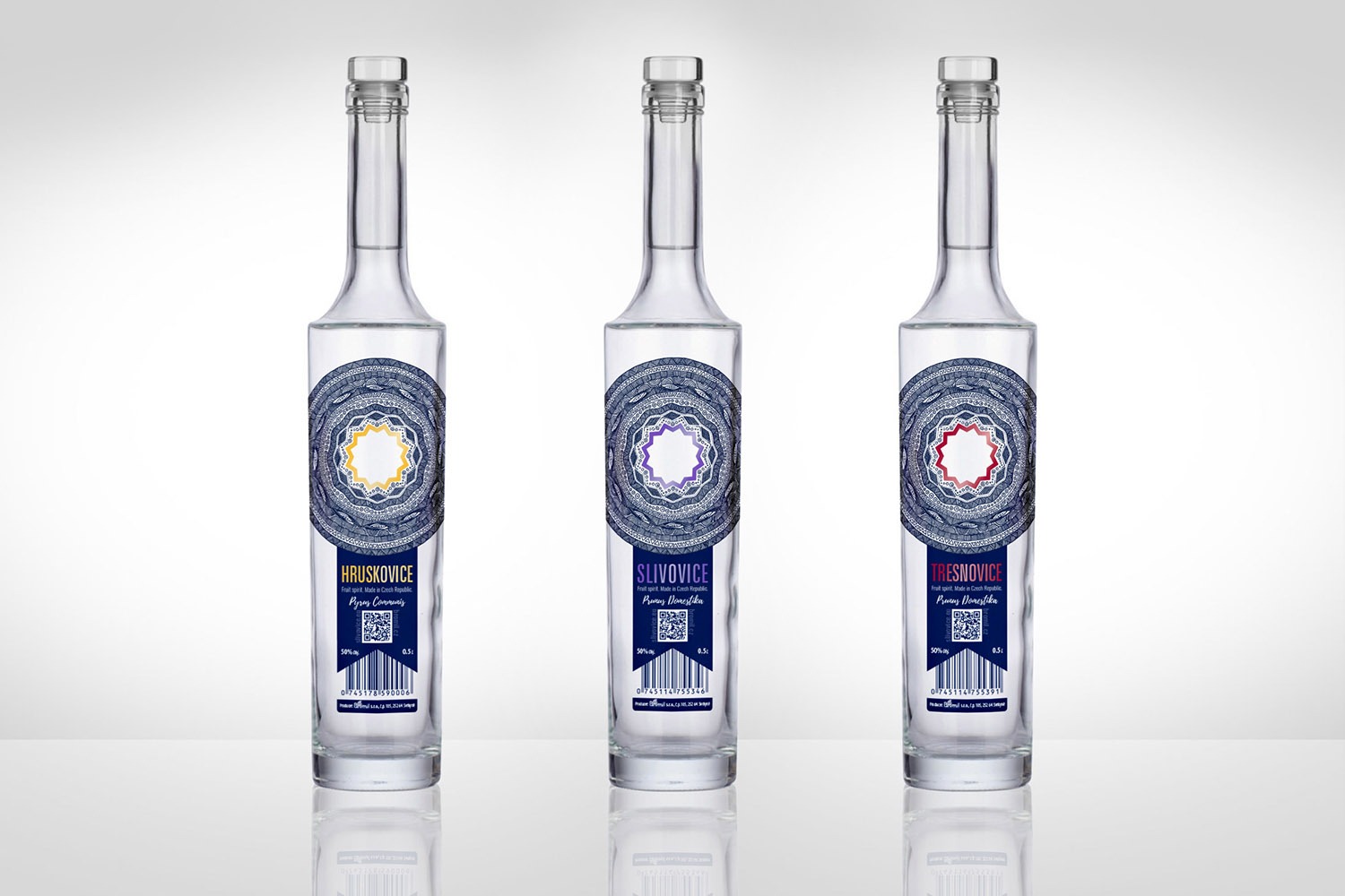
Pantone 281 is dark blue which is used throughout the entire spirit series. I settled for deep dark blue which is rich and luxurious. Blue promotes peace and tranquillity, calmness, and serenity.

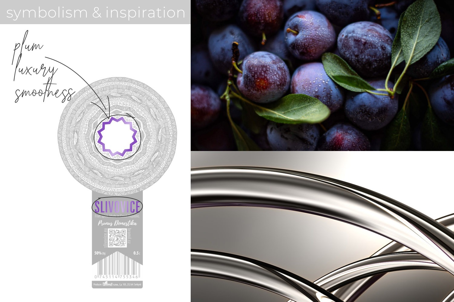
Pantone 2665 is violet and stands for plums. Each type of fruit has its own complement colour to differ each item of the series. Violet combines the calm stability of blue and the fierce energy of red. Violet is often associated with royalty, nobility, and opulence.

White is used as a background for technical parameters such as the barcode and batch number. While used largely for practical reasons, the colour is a blank slate, symbolizing a new beginning or fresh start and embodies concepts like cleanliness, freshness, and simplicity.
Fonts
The headline font is Zurich font, sans-serif, condensed, and bold. The simplicity of the font accommodates the layout of the label.
The title of the Latin name of trees that grow fruits for the spirit is in Playlist font. It is script font and in contrast with the headline.
Content text is in Myriad Pro which is a clean, unobtrusive, and pleasant font family with many styles.

Print technology and effects
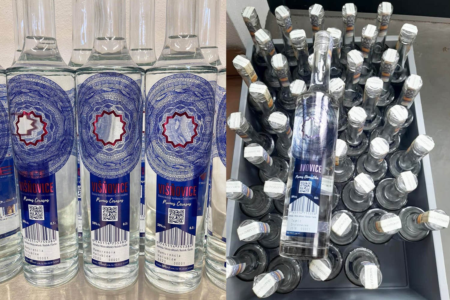
The label is transparent polyester offset printed with three colours; Pantone 281, white, and complementary Pantone of each spirit kind. The metallic effect is made embossed and printed over with complementary Pantone. Extra white space between bar code and address bar is left for the identification of every batch.
Inspiration and work process
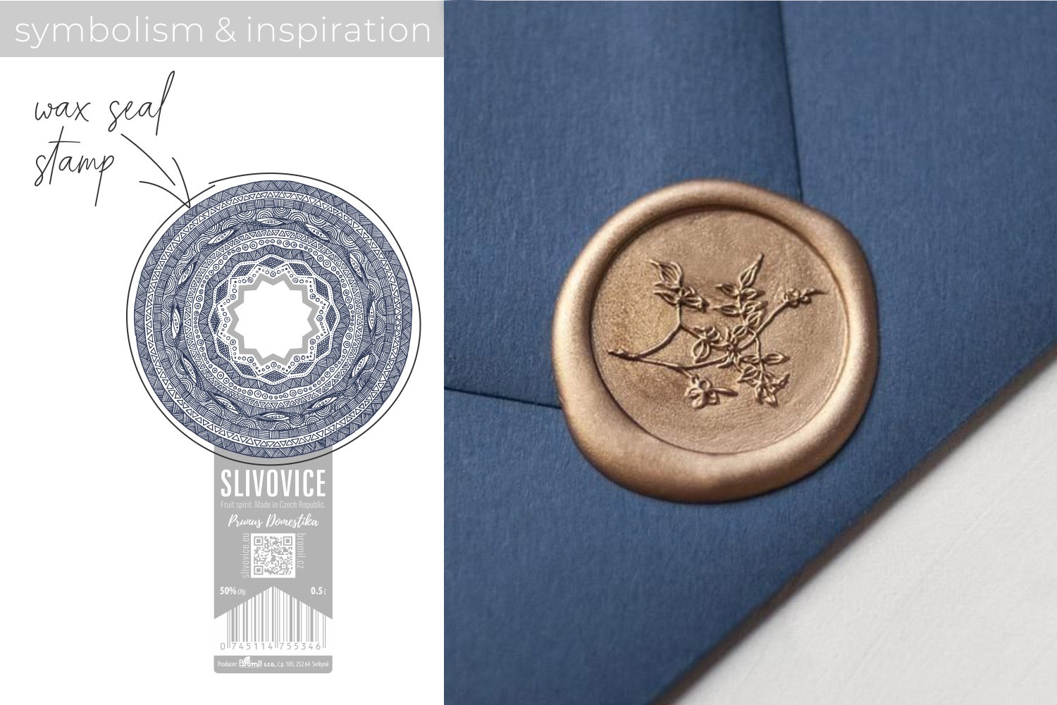
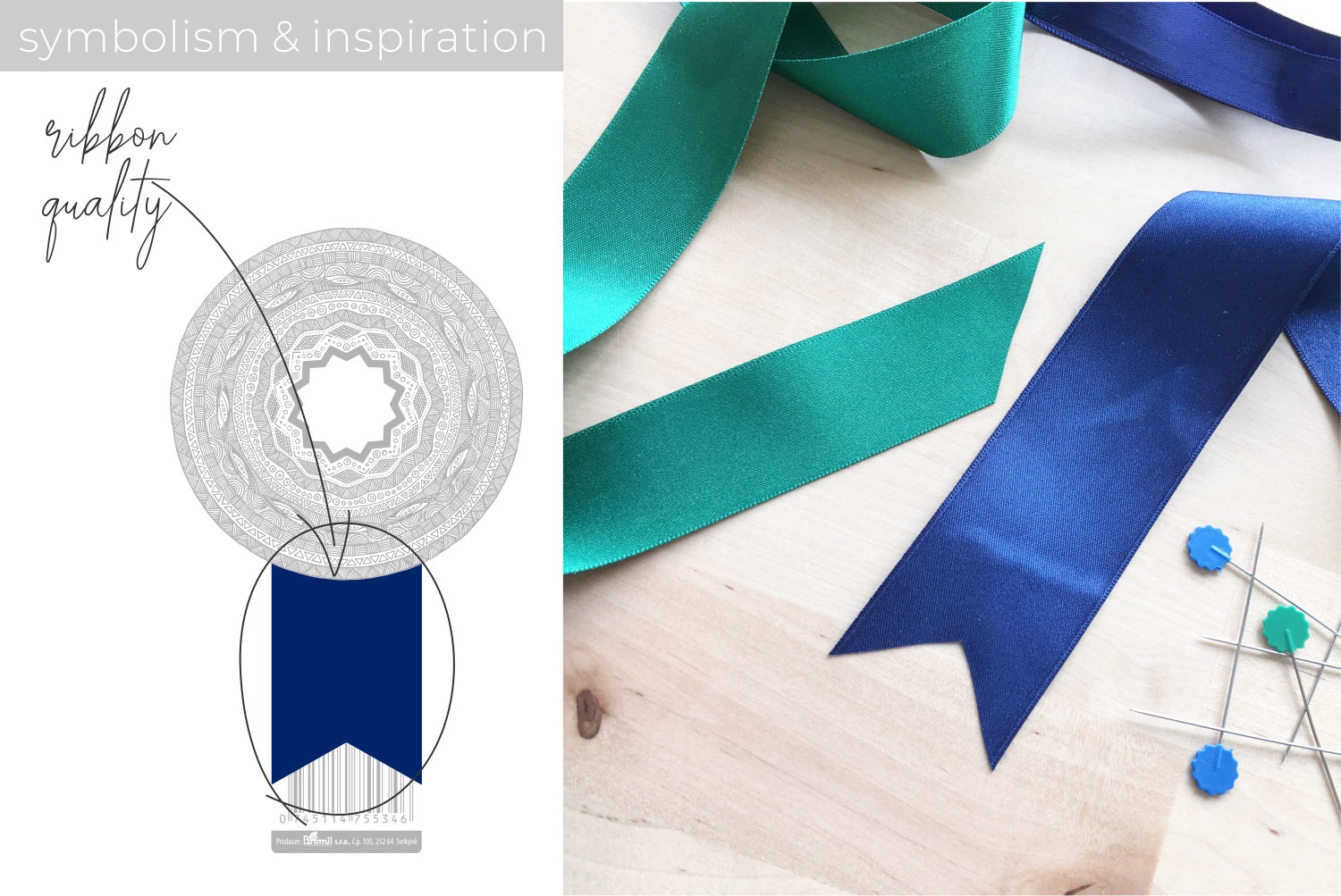
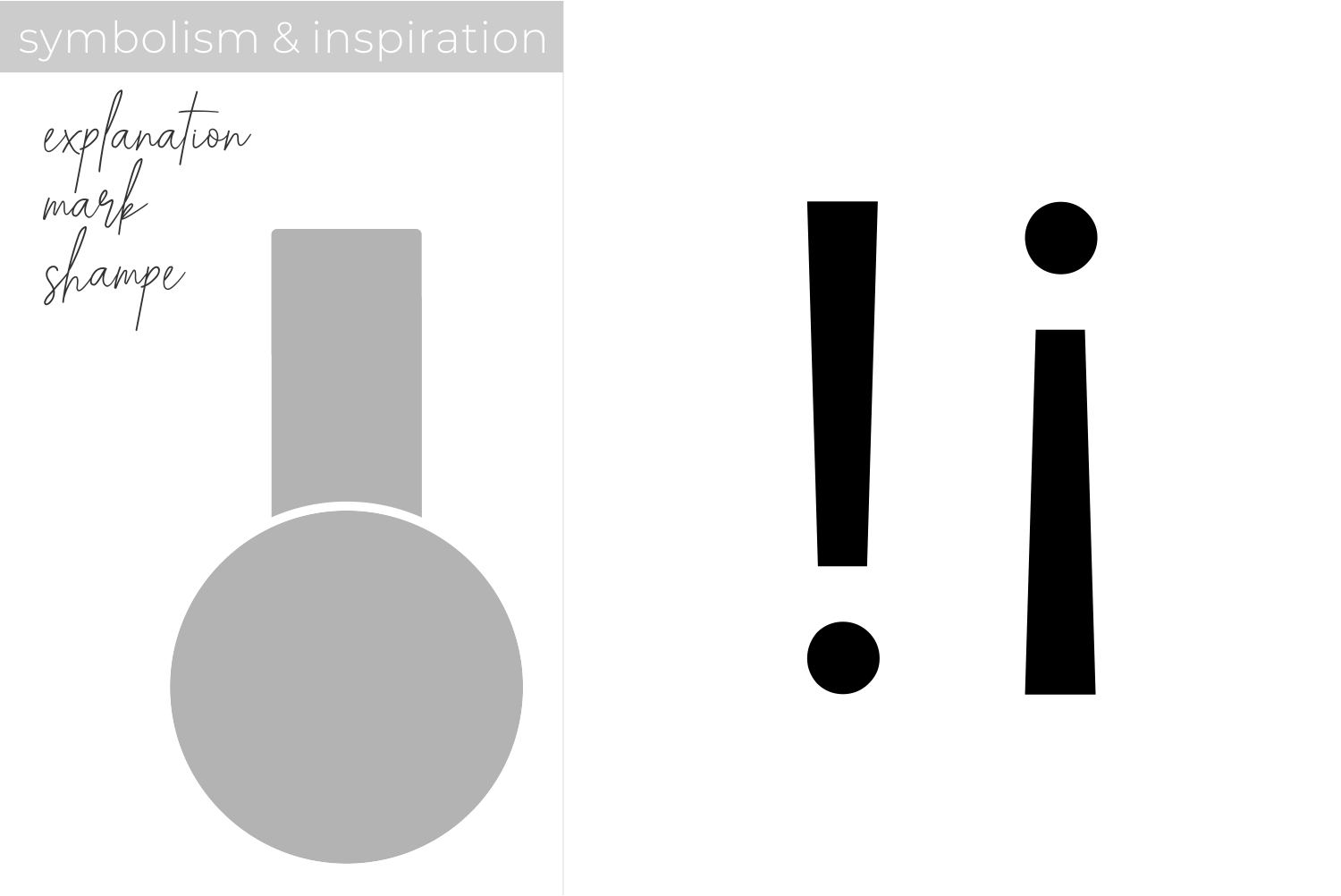
The main condition of the design was that all the content must be on one label. This is the reason for the address of the producer, bar code etc., being on one ‘page.’ I was part of the bottle selection and worked closely with the producer on the final package vision. I aimed for a luxurious, yet simple and unique design. My inspiration was a wax seal with a ribbon and the shape of an exclamation mark. The main circular design is made by hand and is influenced zentangle patterns. I chose to draw it by hand and digitize it afterwards because irregularity brings interest and shows how each year, season, and fruit are as unique as the batches of each spirit. The star in the center brings focus to the content and reminds us that the inside is more important than the shell. All text content is placed on the ‘ribbon’ and the QR code provides a link to the story of the beverage.