Case Study: Bromil syrups labels
Bromil s.r.o. is a medium-sized farm located in a central Bohemian region close to Prague, Czech Republic. It is a beautiful place with fruit orchards, lavender fields and more, owned by a young couple whose family has been in farming for generations. This project is about transformation; from flowers and fruit to syrups and tasty drinks. I am always fascinated by nature’s metamorphosis and our coexistence with it.
Colours
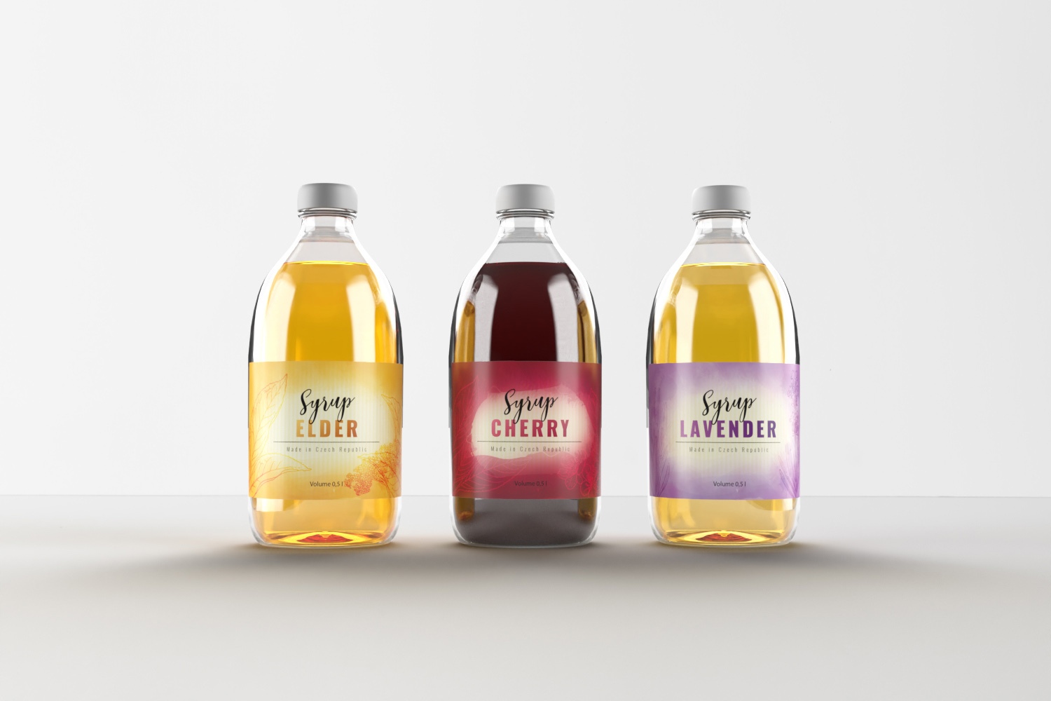
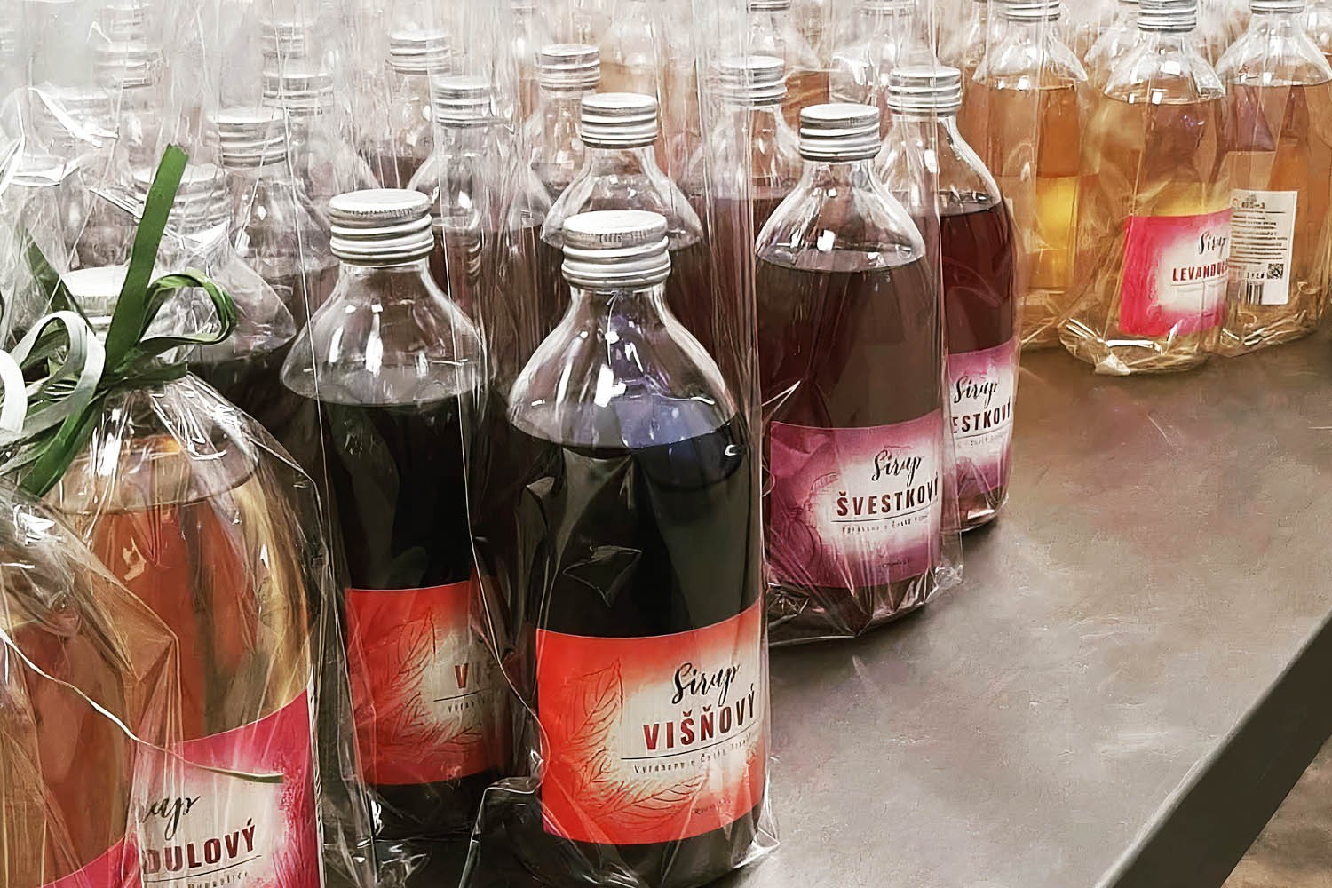
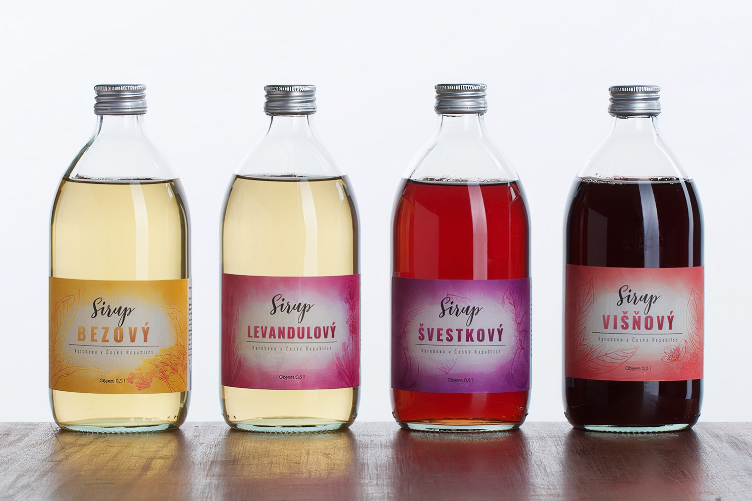
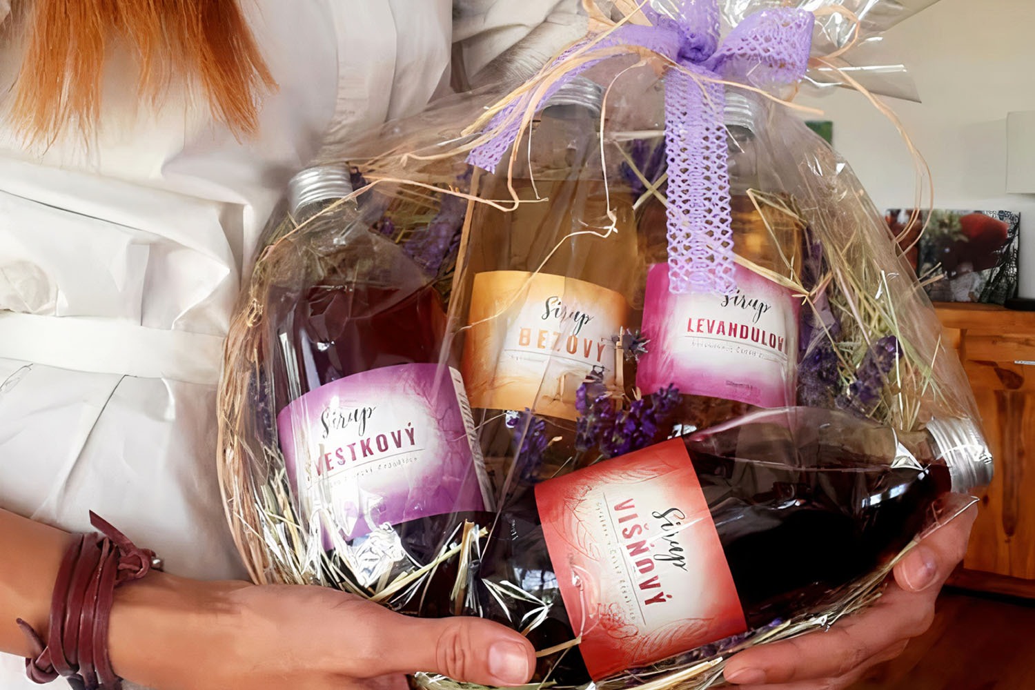
There are four label designs in this series: Elderberry, Cherry, Plum and Lavender syrups. I aimed to match the label colours with the ingredients and achieve distinction between the types. The main paper-like background signifies organic origin. The soft graduated ingredient-matched colour is complemented with bold title text, while the black script ‘Syrup’ text brings cohesion to the designs.
Fonts
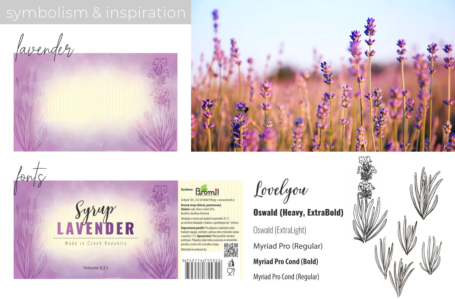
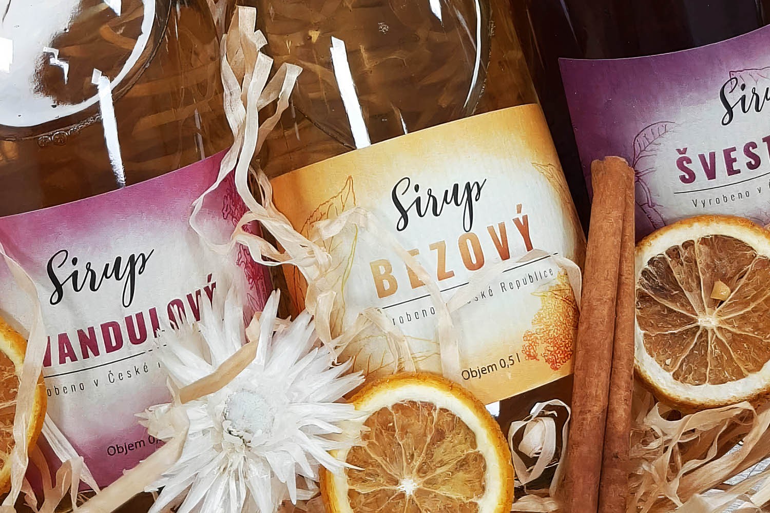
The ‘Syrups’ text is written in the Lovelyou font which, as a script font, brings a dynamic accent and interest into the design concept. The product name uses the bold Oswald sans serif font, bringing the main focus to the center of the label.
Inspiration
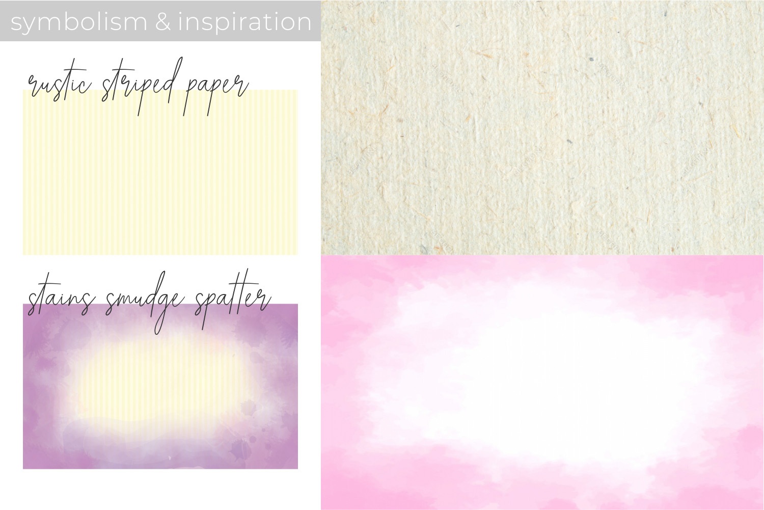
I often tend to think of design in terms of cooking; layers of flavours complementing one another on the way to gastronomic bliss. Each design element has to be in accord with the others to produce functional and appealing packaging. In this instance, the first layer is a rustic striped paper for a traditional, organic look, followed by the surrounding colouring to appear as a tablecloth stained with syrup and juice. The next is a hand drawing of the herb or fruit ingredients of the syrups. These were digitized, vectorized, and implemented into the background. The text is in sync with the rest of the design; functional, resolute, elegant and practical.


